Case Study · 04

Experience Platform.

A real-world experience platform where creators build trails and users discover curated, social experiences through a web-first product.

Consumer Travel · Social Lead Product Designer + Product Strategist 2025–2026 Web · Mobile-first responsive
Key outcomes
Live
Web product live and actively field-tested on the ground in SoCal
15–20
Real trails scoped for validation, up from an initial 5–6 thin test trails
2-track
Validation Path vs Full Product Path framework adopted by the investor group
0→Live
Payment flow, analytics, media capture, and invite-only testing all moved from concept to shipped web flow

This case study is protected.

I designed a creator-led real-world experience platform where people discover and join curated experiences built around trails, stops, and shared moments. Enter the password below or request access.

or
Request sent. I'll follow up within a few hours.
UnlockTrails product showcase
Live Web product
15–20 Validation trails
2-track Strategy adopted
0→Live Payments + analytics
01 The Product

A platform for getting people
off their phone and into their city.

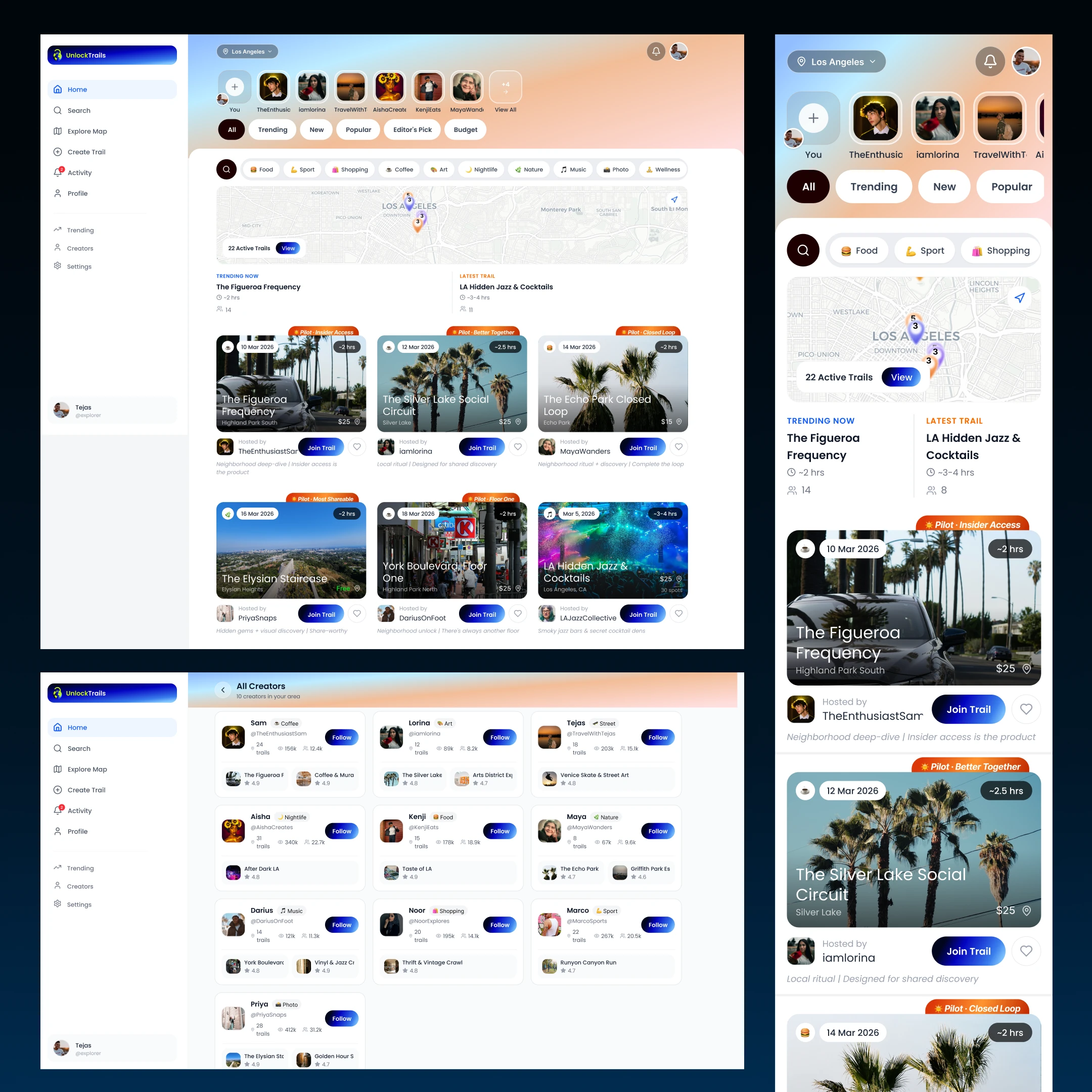
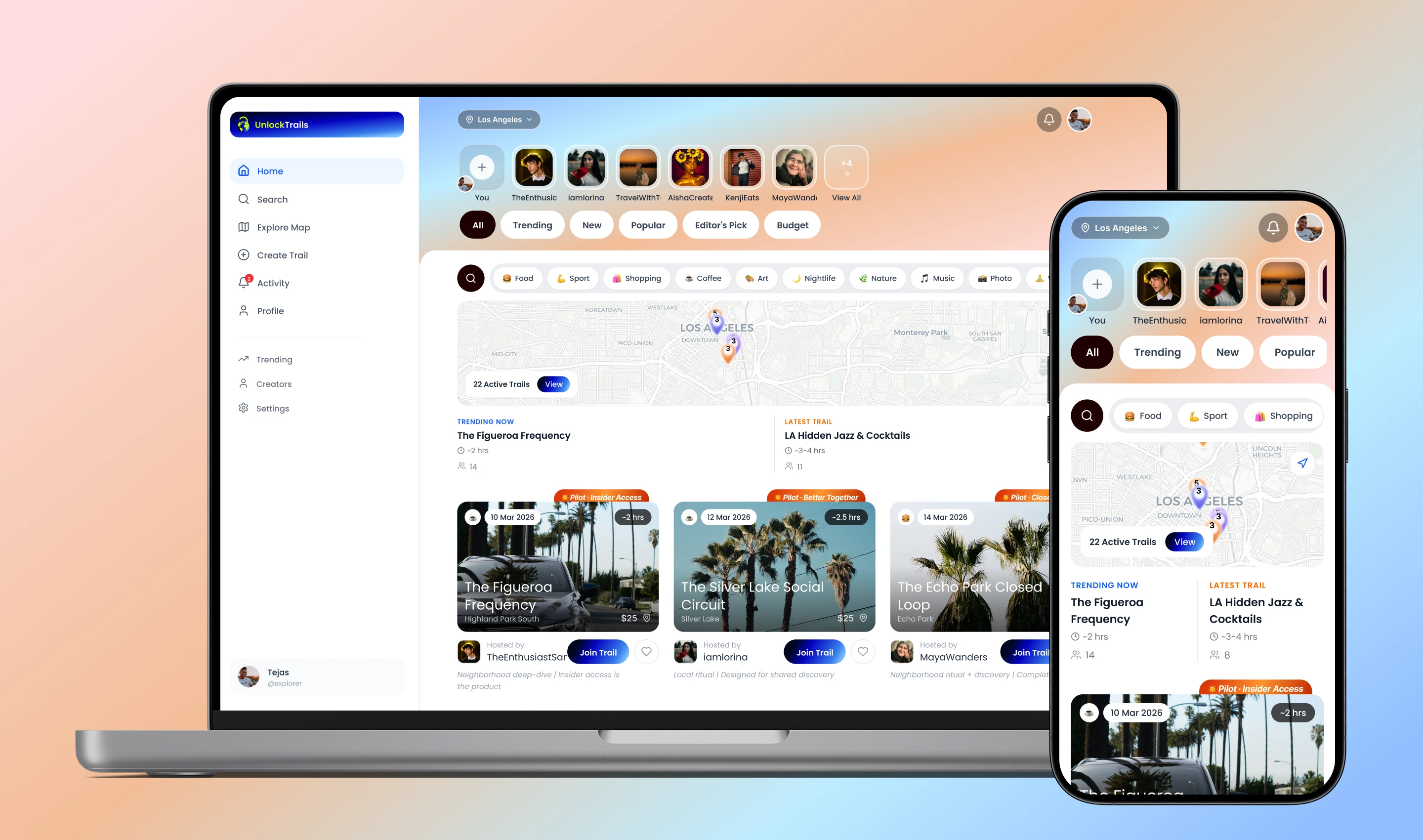
UnlockTrails gives Gen Z users a structured, social way to experience their city, guided by creators they trust, with stops that flow into an intentional day or evening.

The core interaction is simple: a creator builds a trail, users discover it by location or vibe, join free or paid, then move stop-to-stop through a real-world experience with check-ins, media capture, and social completion.

"A trail is not just a route. It's a designed experience with pacing, anticipation, payoff, and a reason to do it with other people."
How it works
01Creator designs a trail with stops, timing, media, and context
02Trail gets validated internally before going live
03Users discover trails by location, category, or creator
04Users join free or paid trails through a lightweight web flow
05Users navigate, check in, capture media, complete, and share
02 The Problem — 0→1

The concept was clear.
The core loops were not.

This was a genuine 0→1 product build around a sharp social thesis: people consume content about their city, but very few platforms help them experience the city itself in a structured, social way.

When I joined, the foundation existed, but the validation-ready product did not. Key loops were incomplete and the platform was not ready to test real behavior in the field.

Validation blockers
⚠️Trail content was too thin, only 5–6 trails, not enough for real field testing
⚠️Payment flow scaffolded but not truly functional end-to-end
⚠️No media capture at trail stops
⚠️No demand-signal layer before join
⚠️No admin visibility into live field test activity
Concept overview
A sequenced journey through your own city

Coffee to music to activity to brunch. Not an event — a designed experience.
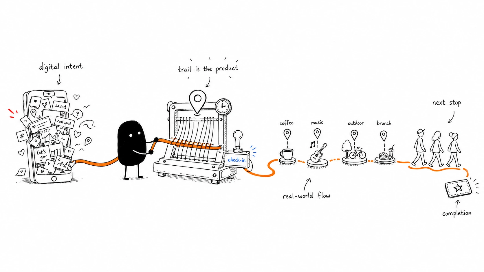
A sequenced journey through your own city
02.5 — Research · Competitive Analysis

From swiping
to showing up.

2026's defining consumer-social trend is the shift from swiping to showing up — TechCrunch, Tinder, and Bumble have all publicly pivoted toward IRL. "Meeting new people is becoming a product category, not a side feature." The demand is real; the formats are still being invented. Every competitor offers a single-point experience. Nobody offers a sequenced journey.

Swipe to compare →

Criteria Timeleft Partiful Meetup Fever 222 UnlockTrails ↗
Core model Dinner with 5 matched strangers Party-planning tool Interest-based groups Curated experience tickets AI-matched group meetups Multi-stop curated trails
Scale 3M+ users, 200+ cities Gen Z viral, App Store Award finalist 2024 2+ decades, most cities Global, experience marketplace iOS-only, single-city Field-testing, LA
Strength Speed to real connection, matching Viral Gen Z brand, expressive invites Scale, breadth, established Curated experiences, ticketing Curated serendipity, vetting Sequenced journey format
Key gap Single format (dinners only) Planning tool, not discovery/experience Dated UX, older demographic Transactional, not social/community Closed, exclusive, single-city Early-stage, building density
Structure One event One event One group One event One event Journey: coffee → music → activity → brunch
Social loop Match → dine Invite → RSVP Join → attend Buy → attend Match → meet Discover → Join → Experience → Share
Audience Millennials + Gen Z Gen Z Mixed / older Mixed Urban Gen Z US Gen Z
Monetization Subscription Free (monetizing) Group fees Ticket margin $22.22 curation fee Entry fee + experience margin
Key insight
Every competitor offers a single point experience — one dinner, one party, one event, one group. Nobody offers a structured, multi-stop journey that sequences a whole day or evening into one curated trail.
Where UnlockTrails wins
The trail is the format innovation. While the category fights over single-event formats, UnlockTrails owns the sequenced multi-stop journey — a higher-engagement, more memorable, more shareable unit of real-world experience, aimed squarely at US Gen Z appetite for IRL.
03 Beyond the Brief

I wasn't just designing screens.
I was shaping the product strategy.

Role 01
Lead Product Designer
Owned end-to-end product UI/UX across discovery, trail participation, admin, and validation flows.
Role 02
Product Strategist
Authored the complete product direction document, creator model, 50 founding trails strategy, 22-week delivery framing, and roadmap logic.
Role 03
Two-Track Framework
Proposed Validation Path vs Full Product Path. The investor group adopted this as the working product strategy.
Role 04
Technical Scoping
Defined Stripe flow requirements, AWS media storage expectations, and field-test analytics instrumentation needs.
"This is a very strong full-product view. It's clear you've thought through not just the build, but the sequencing, dependencies, and what it would actually take to get something into the App Store in a real way."
Client · Japanese-backed investment group
04Core Design Challenge

A trail is physical.
The app has to support it without hijacking it.

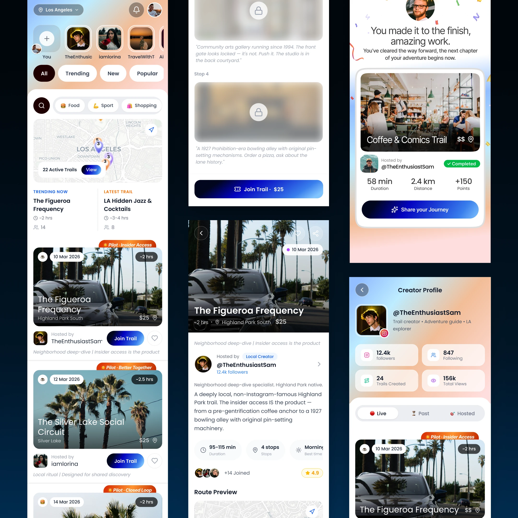
The hardest design decision was the physical-to-digital handoff. This is not a couch app. It's something users glance at while walking, coordinating with friends, checking in at a stop, or moving through a real place with patchy connectivity.

The UX had to be glanceable, anticipatory, low-friction, and resilient outdoors. It needed to build momentum without spoiling the next stop, and make check-in feel natural instead of transactional.

What would fail
❌ Too Much App
Heavy screens between stops
Form-like check-ins
Overloaded route detail upfront
Media capture breaking flow
What the UX had to do
✅ Support the Journey
Glanceable trail guidance outdoors
Progressive reveal of the next stop
Low-connectivity friendly flow
Check-in and media capture that feel natural
05Insight That Changed Direction

The trail itself is the product.
The app is the delivery layer.

One direction-setting insight changed the entire prioritisation: each trail had to be treated like its own designed product. Real locations, real sequence, real timing, real imagery, real social energy.

That shifted the focus from generic UI polish to trail architecture. Every screen had to behave like a teaser for what was next, not a dump of route data. The value was the experience design of the trail itself.

Trail-first
The app is not the hero. The experience in the city is.
Teaser UX
Every trail screen should create anticipation for the next stop rather than exhaust the story upfront.
06What Was Designed & Built

Discovery, participation, admin,
and the validation infrastructure around all of it.

Discovery & Browsing
01
Trail Discovery Feed
Browse trails by location, category, creator, and momentum with mobile-first layout priority.
02
Trail Detail Page
Stops, timing, pricing, prize pool, creator profile, and join CTA structured for quick decision-making.
03
Interest Capture
An "Interested" action before join to measure demand and signal intent before payment.
04
Invite-Only Mode
Private links and invite code logic for controlled field testing with real participants.
Participation Flow
05
Free + Paid Join Flow
Participation flow for both free and paid trails, including Stripe handling and failure states.
06
Stop-to-Stop Navigation
Structured progression through a trail, with route pacing and progression clarity built in.
07
Location Check-in
Check-in flow tied to the real-world journey, designed to feel lightweight instead of admin-heavy.
08
Media Capture
Photo and video capture at stops, attached to the trail experience without interrupting the moment.
Completion, Social, and Admin
09
Completion + Feedback
Post-completion feedback prompt to measure whether the trail felt worth doing and worth repeating.
10
Profile + Activity
User profile, trail history, creator portfolio, and social continuity across experiences.
11
Admin Analytics
Trail start rate, completion rate, payment conversion, interest-to-join conversion, and return behavior instrumentation.
12
Infrastructure Scoping
Stripe setup requirements, AWS S3 media storage architecture, and content structure for 15–20 real SoCal trails.
07Outcomes & Metrics

A stronger validation product.
And a strategy the investors actually adopted.

Live
Web product field-testing in SoCal with real-world trails and live user behavior
Trail count expanded from 5–6 to a 15–20 trail validation target
0→Live
Payment flow moved from scaffolded to fully operational with Stripe
Adopted
Two-track product strategy formally accepted by the Japanese-backed investment group
"I was able to jump into the live experience and it's already looking stronger and stronger every time. Especially seeing the core product loop is clearly coming together: Discovery → Join → Experience → Share."
Client · Japanese-backed investment group
15–20
Real SoCal trails structured for validation instead of a handful of thin prototypes
Stripe
End-to-end paid trail participation flow operational
Analytics
Trail start, completion, payment conversion, and interest-to-join signals instrumented
$2T+
Experience economy context framing the market opportunity behind the product thesis
08AI in This Project

AI accelerated the documents.
The product thinking stayed human.

AI ToolUsed forHuman override
ClaudeProduct direction document drafting, Stripe requirements, validation sprint scoping, and email communication supportAll strategic calls, all UX logic, all product sequencing, and the full two-track framework
Figma AIComponent variants and rapid iteration supportVisual judgment, final screen decisions, and quality control
"AI helped me draft and structure complex product documents faster, but the decisions about what to validate, how to sequence the build, and what the product actually needed to succeed were mine."
Back to portfolio
View all projects
Zoftware · Eazy6 · Medvisor · UnlockTrails
All work